Thursday, March 18, 2010 @6:36 PM
Assignment 5 - Fighting Climate Change [Info Graphic]
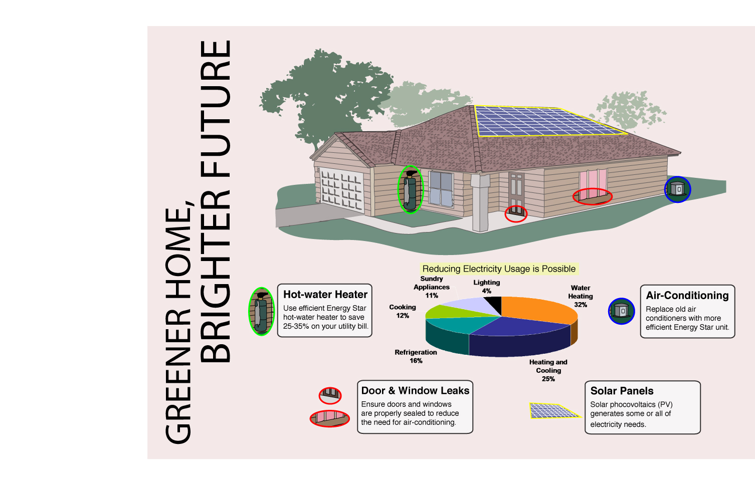
Greener Home Brighter Future

Design Principles
Harmony
The shape, size and colour of the White text box that outlines the texts are the same, creating a harmonious feel.
Contrast
The shape, size and colour of the pie chart are significantly different from the text and its textbook in order to create an emphasis through contrast.
Unity
Using different levels of harmony and contrast, I aim to achieve the right level of unity which is not excessive or too little.
Emphasis through contrast
The main image of the house is generally opaque and light coloured. I used coloured circles to identify certain objects around the house with the objects having less opaque and brighter colours. With such contrast, identifying the important objects would be easy.
Balance
I have balanced out the number of textbooks surrounding the pie chart to be 2 on each side in order to create a balance. The spacings between the pie chart and the textbook is also the same to maintain this balance.
♥ Aldrich
Monday, March 15, 2010 @6:33 PM
Assignment 5 - Greener Home Brighter Future Draft
Article of Illustration:

The article shares 10 ways we can adopt to fight cimate change. The measures suggested vary from becoming a transition town and changing lightbulbs to energy efficient one. I also gathered information from other articles which suggest other ways such as using solar power, energy efficient water heater and minimizing air leakage at home.
However, I wanted to make my infography more personalised. Hence, I decided to narrow down the various measures to just those that can be done just around one’s personal home.
The message that I want to bring across is that when you create a greener home for yourself, you are actually creating a better future for everyone else.
1st Draft

This is my first draft of my infography. I thought that the design are too simple and I decided to do another design to better suit the target audience which are the readers of National Geographic, Economist, Asia Week, Fortune or News Week
2nd Draft
This is my 2nd draft of my infography. I evaluated that the designs are appropriate but the layout is rather common. Hence, I decided to try something different by using a different layout, using colours to guide reader instead and also add some statistics to enhance it.
♥ Aldrich
Thursday, March 11, 2010 @6:41 PM
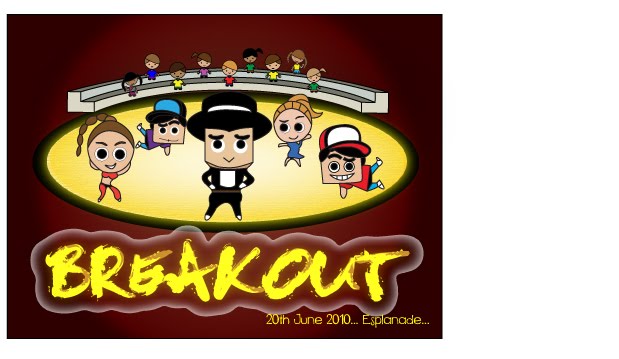
Assignment 4 - Colour Coalition [Postcard]
BREAKOUT
Front

Back

♥ Aldrich
Wednesday, March 10, 2010 @6:27 PM
Assignment 4 - Breakout Colour Scheme

Design Concept:
This postcard encourages younger youth of 10-15 years old to take part in BREAKOUT dance competition.
The cute yet cool dancers are posing on the stage where the spotlight is on them and there are many audience watching them. I hope to inspire the younger youth to BREAK OUT of their comfort zone and join this competition. The message behind the design is the idea that it is never too young for youth to start dancing.
Colour Scheme:
I explored 4 different types of colour properties, which were desaturated, saturated, light and dark. I kept the colours for the characters the same and explored the different colours to find a combination that can compliment my characters. I attempted different colours for the fonts, background and stage spotlight. I concluded that dark colour scheme is better in bringing out the spotlight effect. Hence, I kept the background dark and tried to find the best combination.
♥ Aldrich
Tuesday, March 9, 2010 @7:14 PM
Class Exercise E - Talking Form

DISTRESS!

DYNAMIC!!!
♥ Aldrich