Assignment 5 - Fighting Climate Change [Info Graphic]
Greener Home Brighter Future
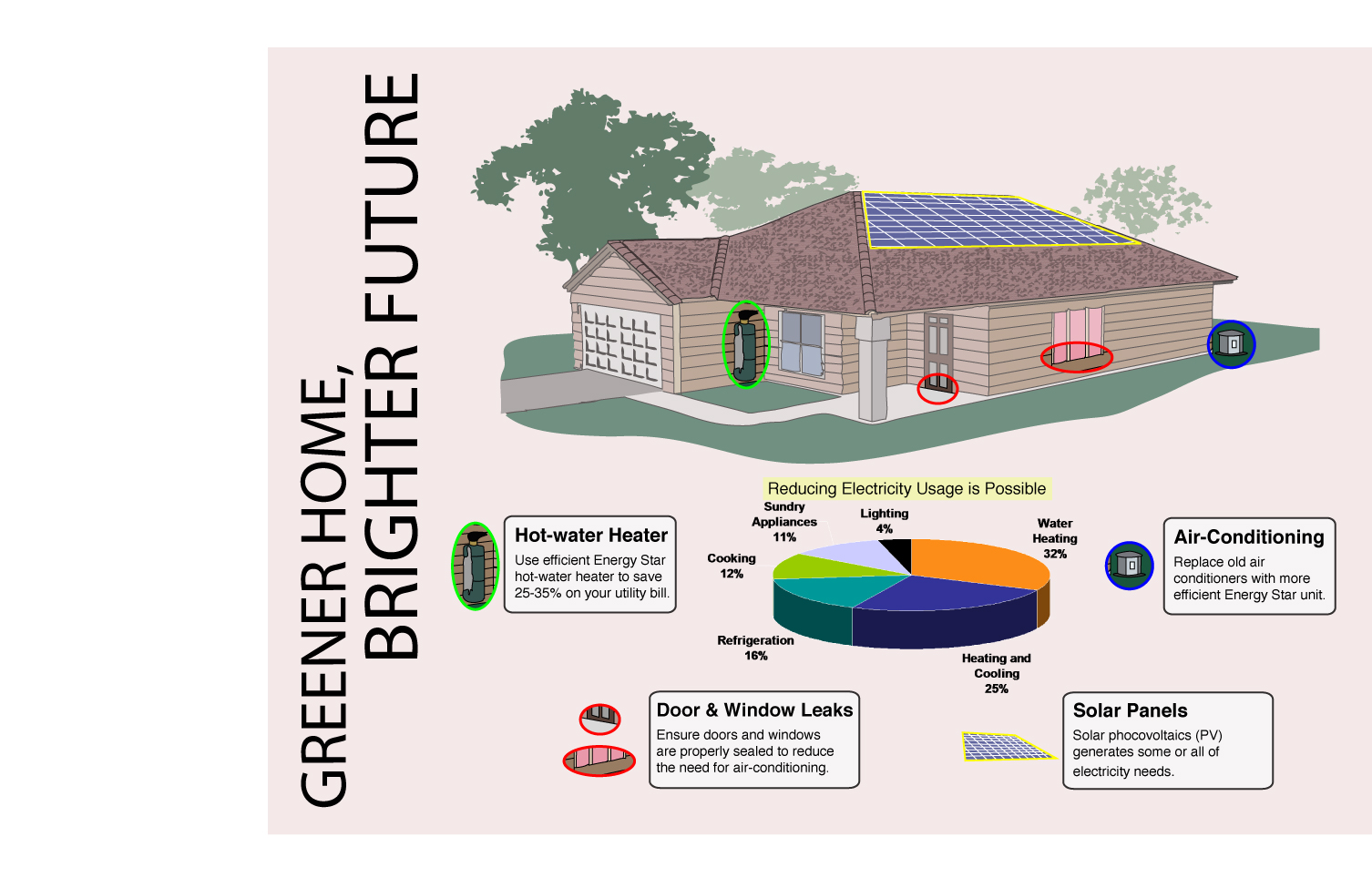
Design Principles
Harmony
The shape, size and colour of the White text box that outlines the texts are the same, creating a harmonious feel.
Contrast
The shape, size and colour of the pie chart are significantly different from the text and its textbook in order to create an emphasis through contrast.
Unity
Using different levels of harmony and contrast, I aim to achieve the right level of unity which is not excessive or too little.
Emphasis through contrast
The main image of the house is generally opaque and light coloured. I used coloured circles to identify certain objects around the house with the objects having less opaque and brighter colours. With such contrast, identifying the important objects would be easy.
Balance
I have balanced out the number of textbooks surrounding the pie chart to be 2 on each side in order to create a balance. The spacings between the pie chart and the textbook is also the same to maintain this balance.
♥ Aldrich